There are some things in life you just can’t unsee. Unfortunately, the only cure to forget these images is time, if that even works. We’ve collected some of the most unbelievable images on the internet of things you just can’t unsee. While these images are probably ones you’ve seen before, once you look at them from a different perspective, you’ll never be able to look at them the same way again.
They’re hidden details that need to be seen. These images include ones with animal-shaped flowers, the shapes of countries, famous actors, and movies. Life is all about gaining a new perspective, so check out several images you simply won’t be able to unsee below.
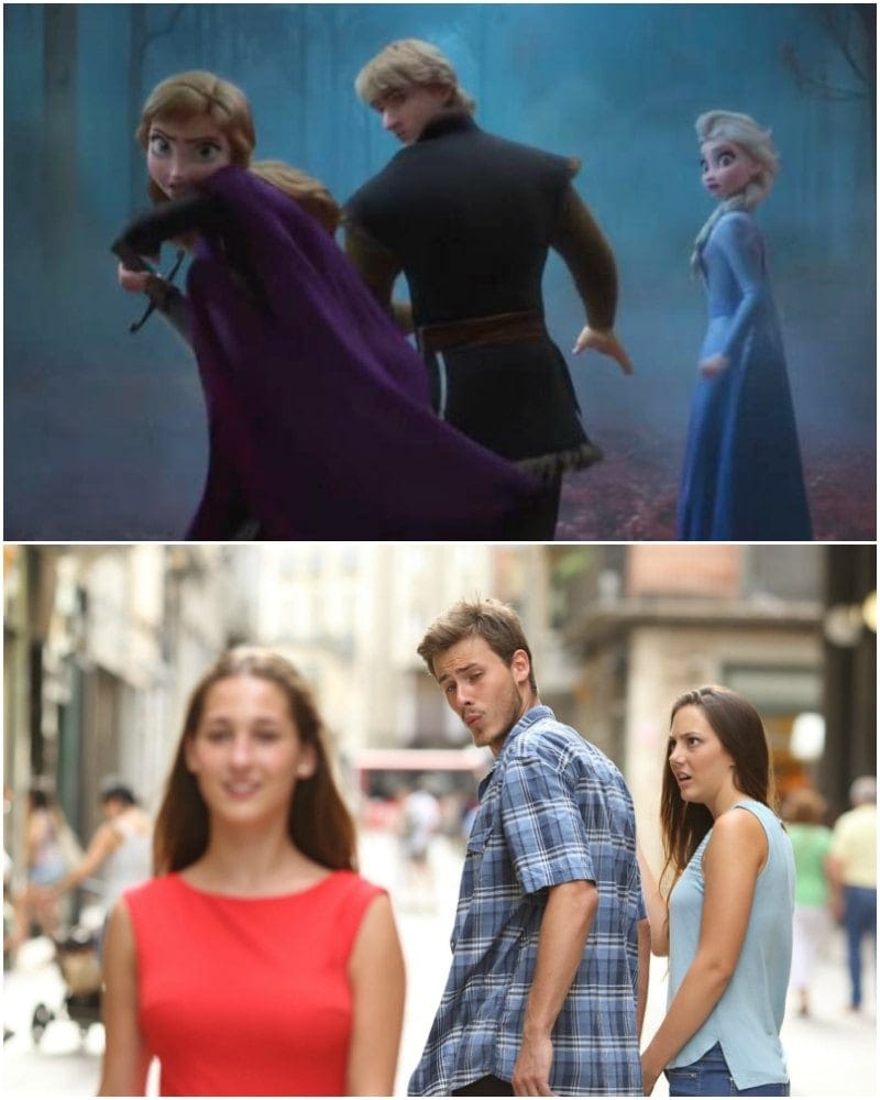
50) Frozen Meme
“Frozen 2” is one of the greatest Disney films out there. It’s the kind of film that brings happiness to all its viewers. That being said, “Frozen” and “Frozen 2” are both impressive movies for meme templates. Somehow, it just works. In this still-frame from “Frozen 2,” we see the replica of a famous meme that we now can’t unsee. The photo shows Kristoff, Anna, and Elsa in the same pose as the distracted boyfriend meme. It’s unknown if it was done on purpose, but it certainly caught our attention (via Constative).